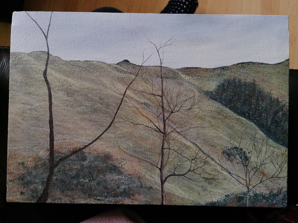
At last week’s tutorial, I brought along my work in progress to get some advice on the progression of the painting. My Tutor and I could both see that the painting was not working as well as it could, due to the way in which the elements of the painting contrasted as a whole. We both agreed that the sky was much too light- not allowing the highlights within the landscape to stand out as well as they should.
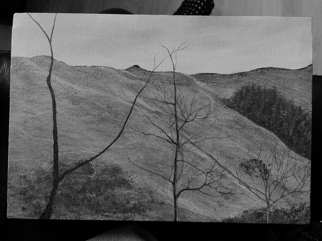
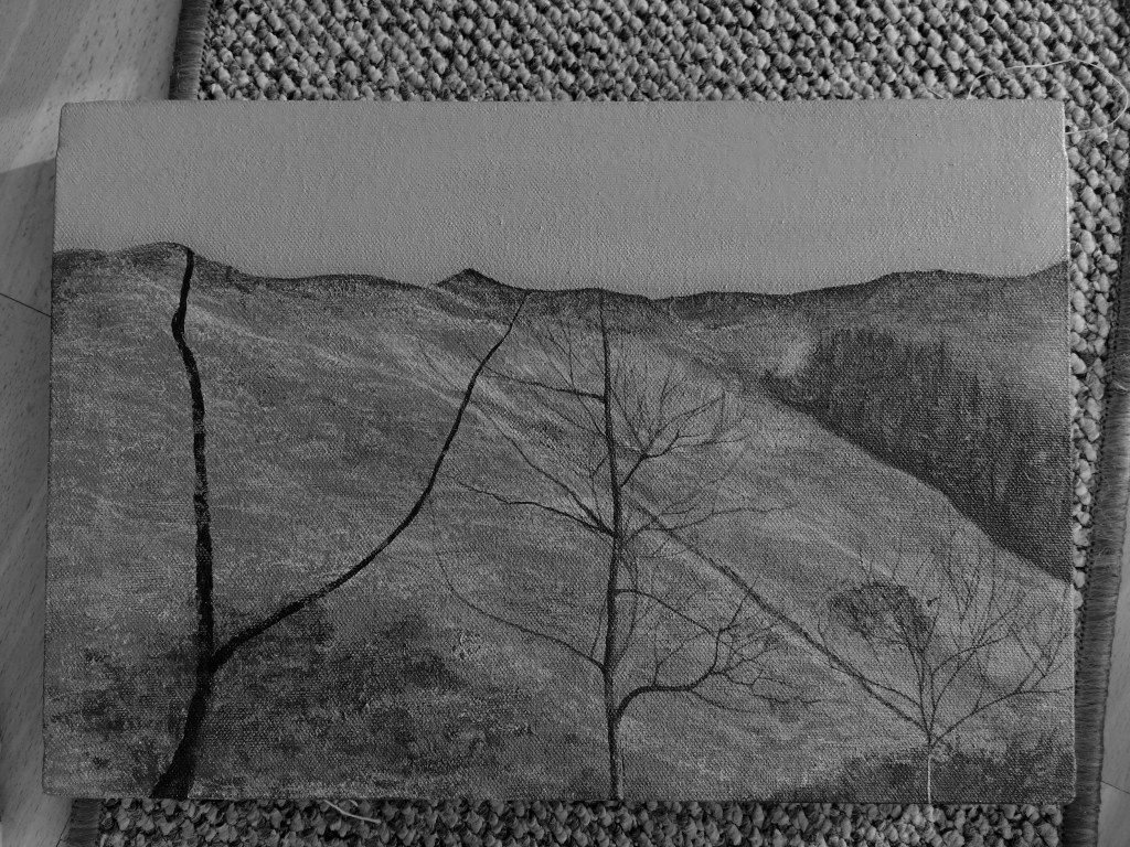
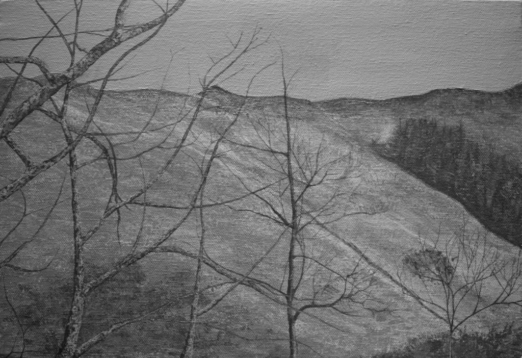
To help me see this muted contrast, I was advised to photograph the painting and convert it to a black and white image. I could now see just how the colours on my canvas restricted one another.
I realised that I needed to choose a more saturated colour for the sky, in order to accentuate the highlights within the landscape:
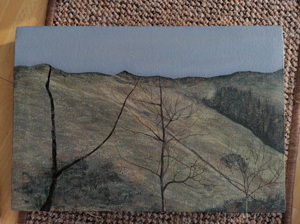
I decided to fill in the area of sky with a solid colour, due to the amount of detail that was present within the rest of the scene. I wanted the sky to correspond with the landscape but to not overpower the composition with excessive detail. I also felt that the top of the hills needed to be more defined, in order to create an even starker contrast within the painting.
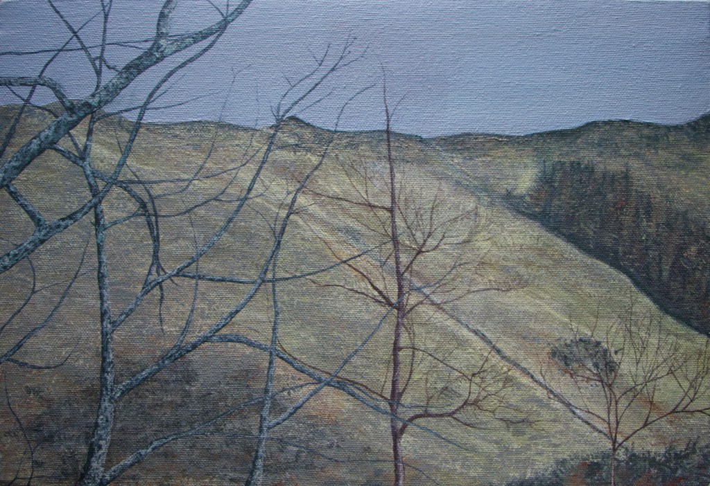
Within this painting, I wanted to present the way the trees within the landscape dissect the composition, creating irregular shapes, which seem to enhance the overall effect of the scene.
